Gunam
Gunam – in Malayalam means the inherent goodness of something. It’s an apt name for products which are made of botanicals – distilled to bring out the very best essence.
The founder Elizabeth is a graduate of Parsons, and worked in the skincare and fragrance industry for many years before pursuing her journey as an entrepreneur. She used the best of all her experiences, as well as her environment – coming from this in that family that source is the best essential oils.
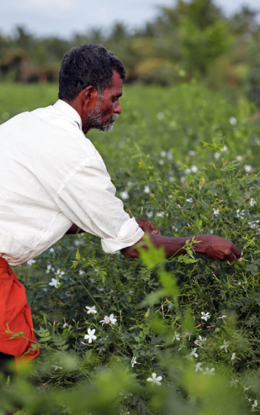
She experimented with many products, and having been a part of the skincare industry on the inside – she understood that there was a place for a brand that focused on using fewer products. This is was the only sustainable way forward. A brand that takes responsibility for its sources (with the backward integration practises at its farms) and use the best of what nature had to offer - coming from a land as abundant as Kerala.
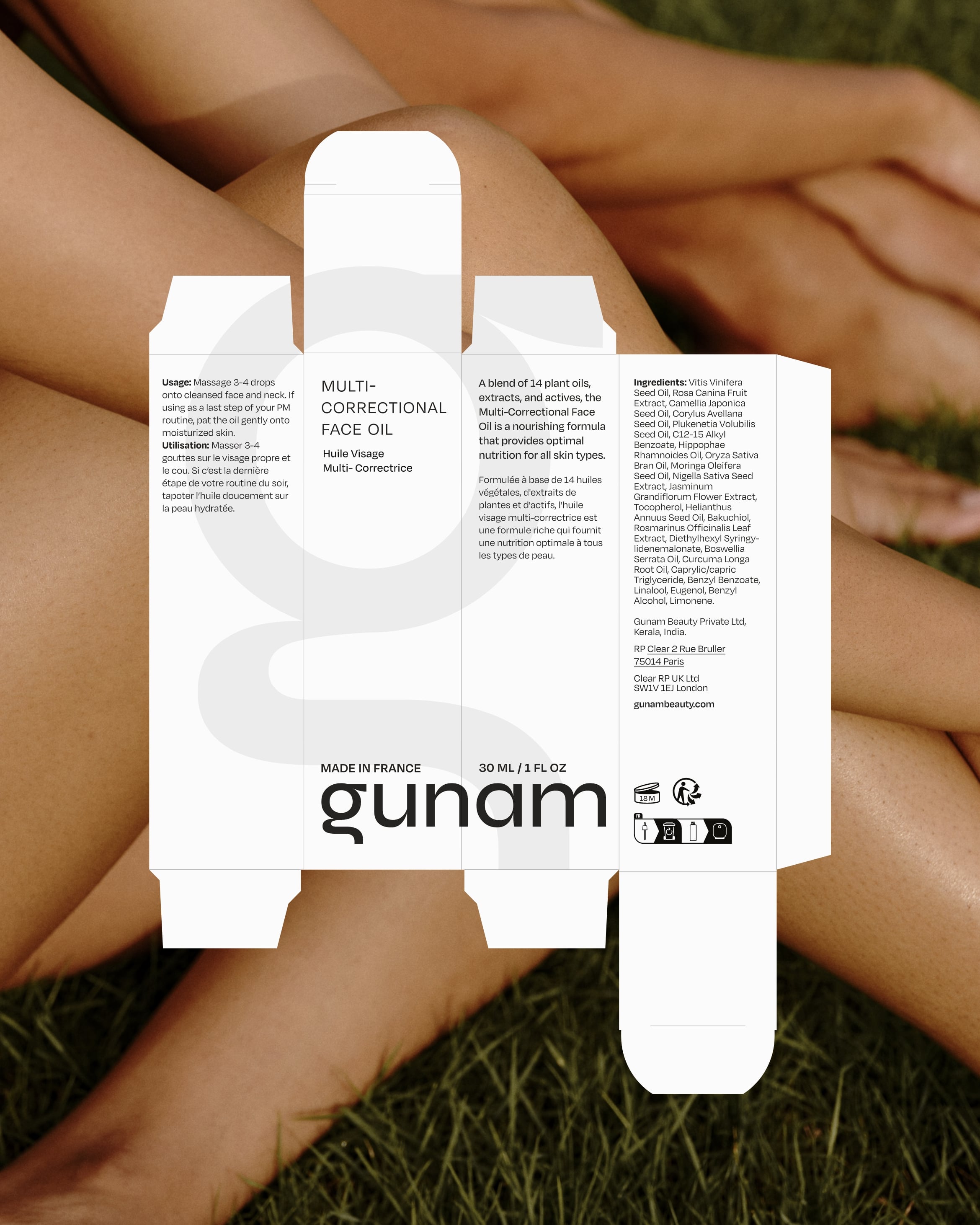
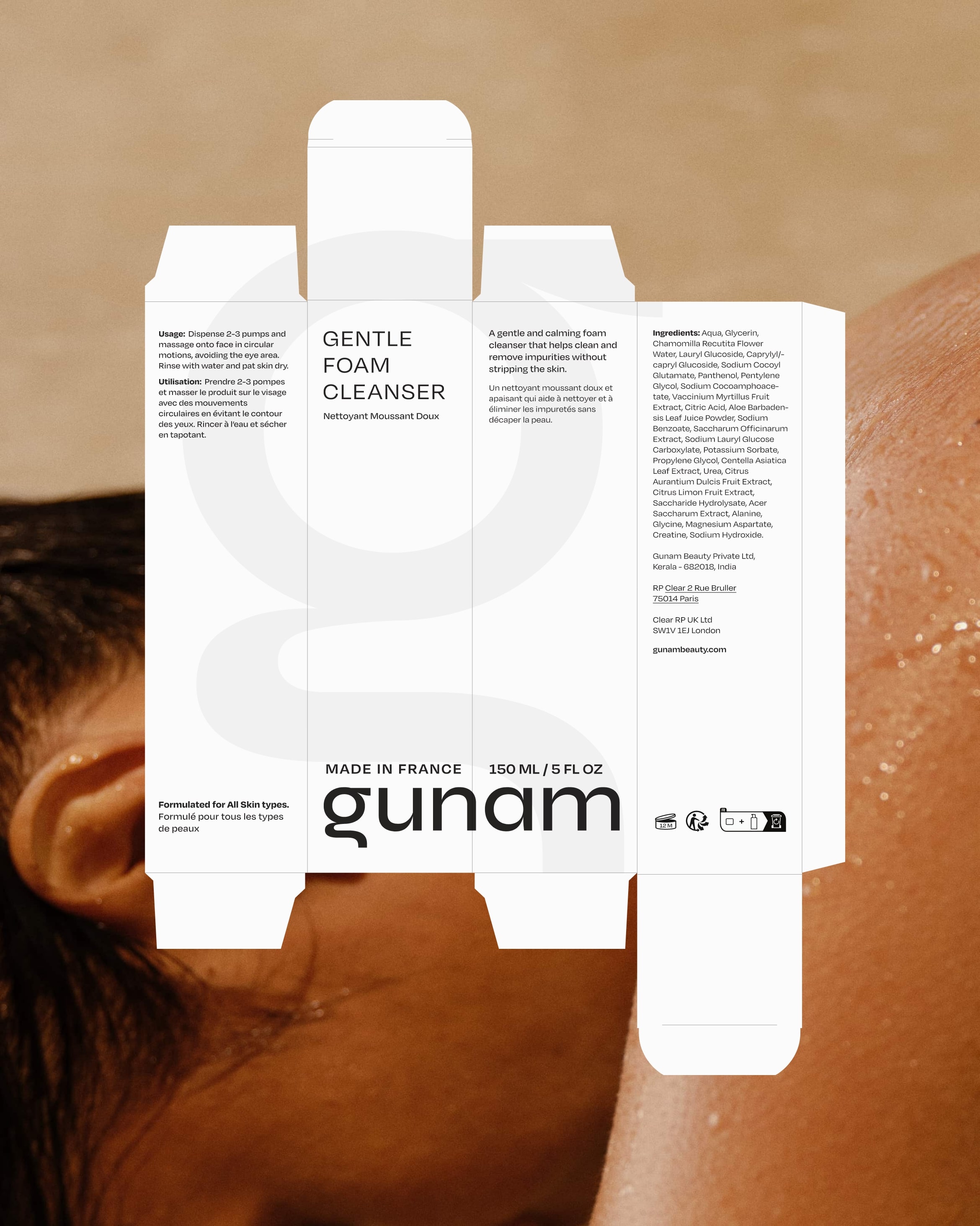
Botanicals have billions of phytonutrients very few of which have names, so , much like the whole foods movement the product uses the goodness of the entire essence and not just singular component derivatives. All of Gunam’s products are formulated from scratch, using some patented components such as PO3, under the most stringent quality standards in a lab in France.
The brand tries away from using hackneyed terms such as clean beauty or at all natural as there are no regulations that verify these claims. Rather it builds trust by being transparent and taking responsibility for each of its ingredients. The products took 2 to 3 years to formulate with many painstaking iterations till they were perfected for the efficacy desired.
When we are approached by a client we don’t ask for a brief rather we get to know them observe them and read into what is not being said. This allows us to peek into their beings and create a world that represents their spirit. The G logo of Gunam is reminiscent of the shape of the Malayali alphabets - where the founder Elizabeth comes from.
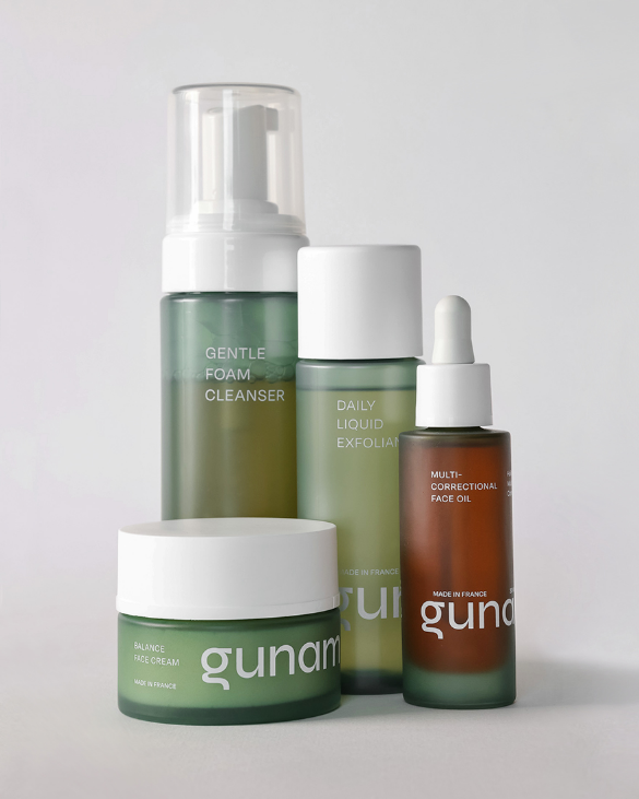
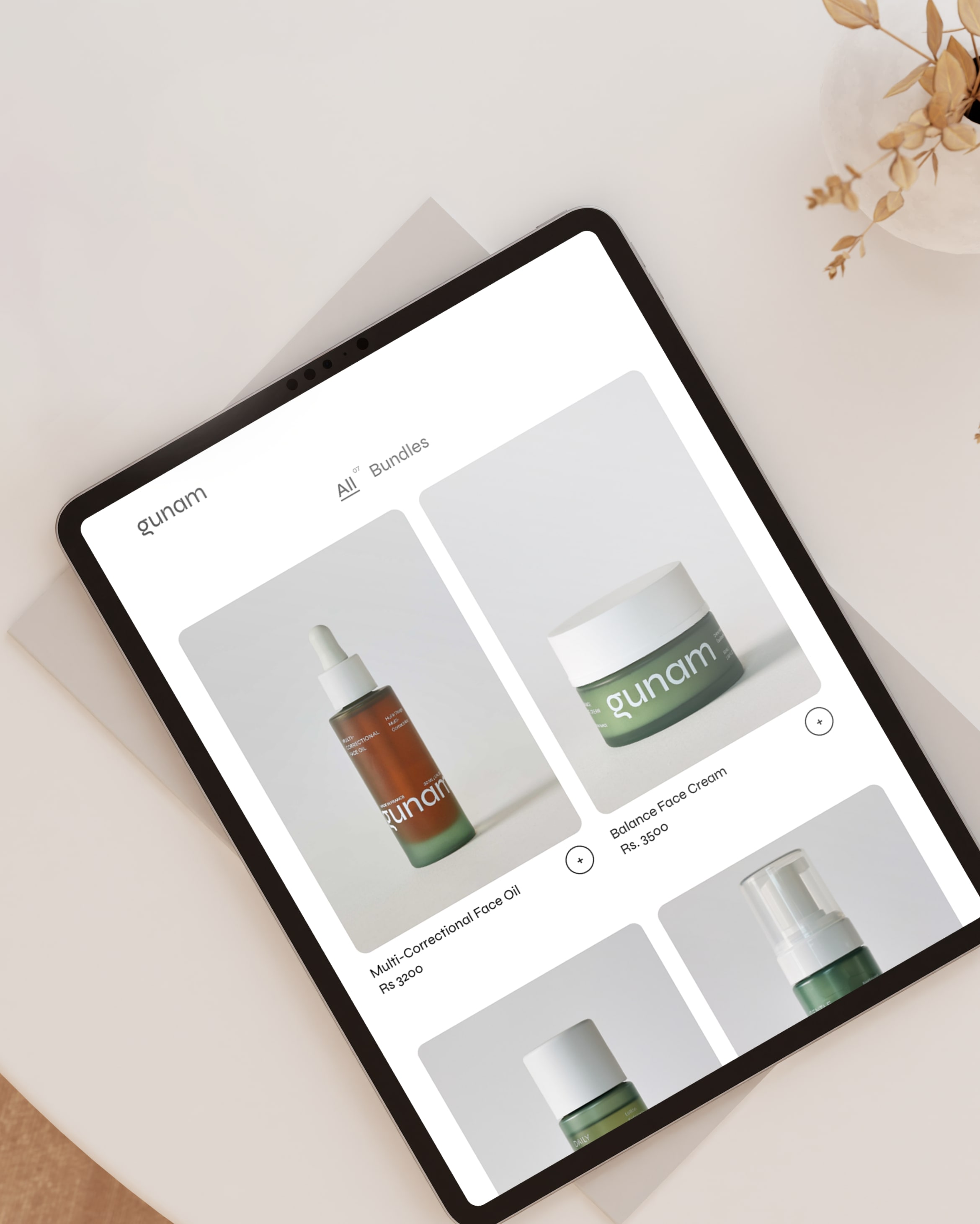
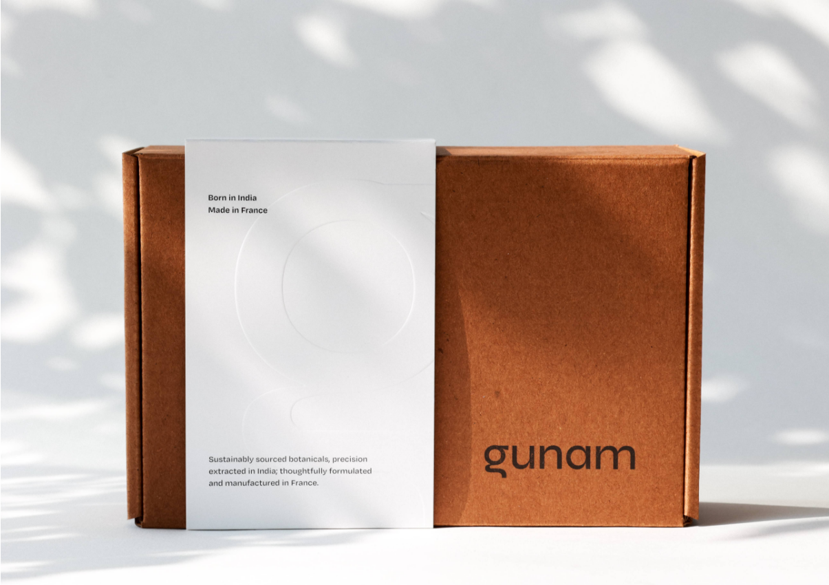
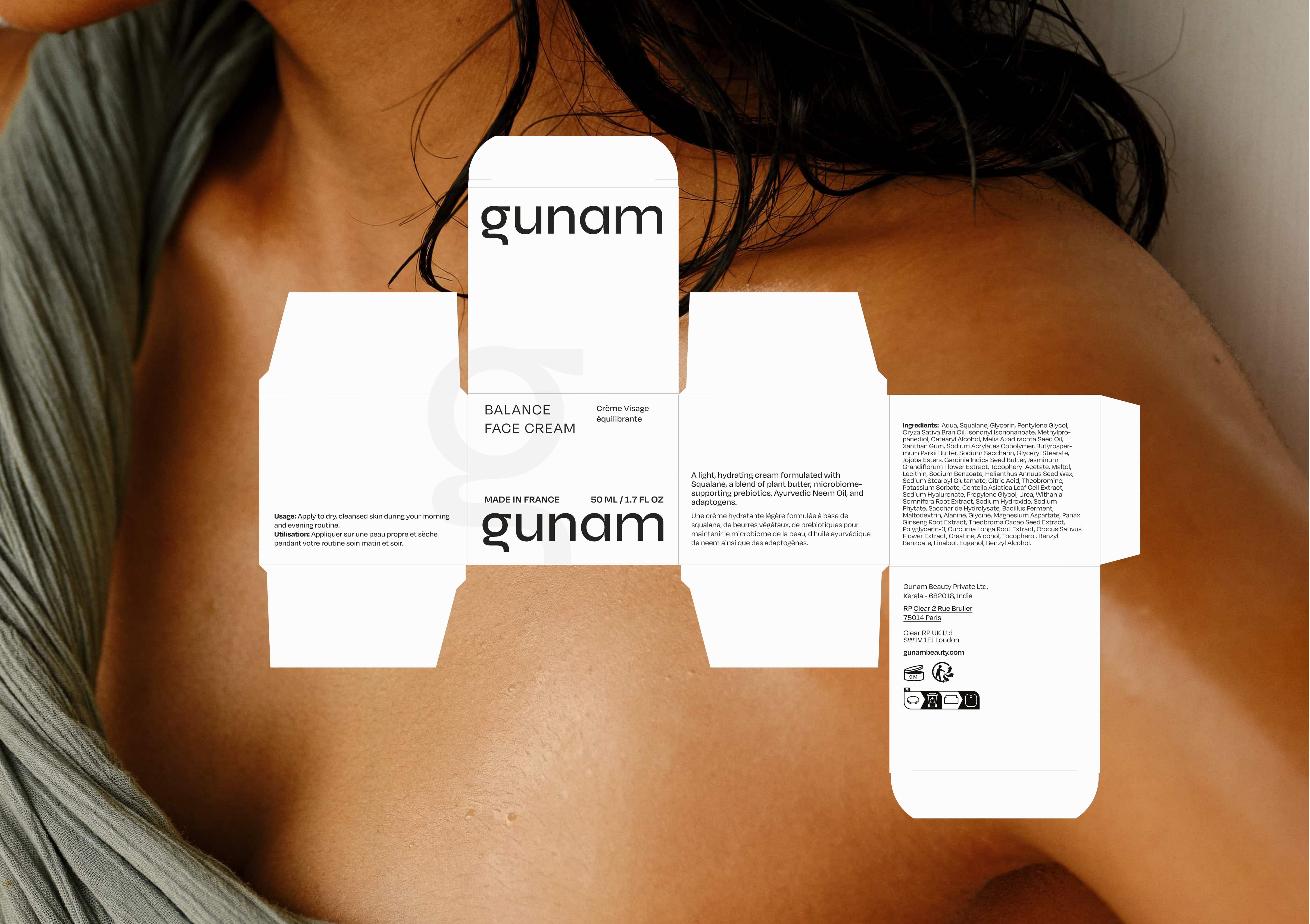
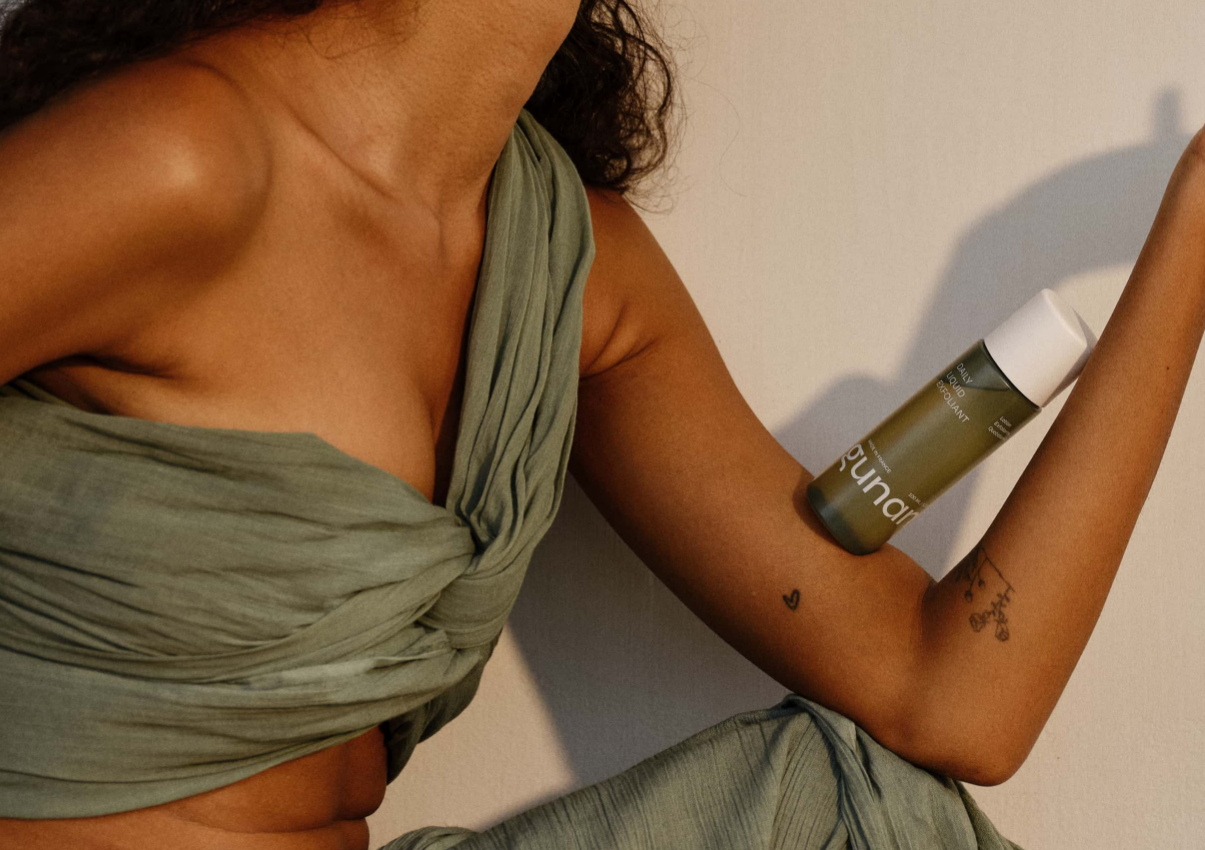
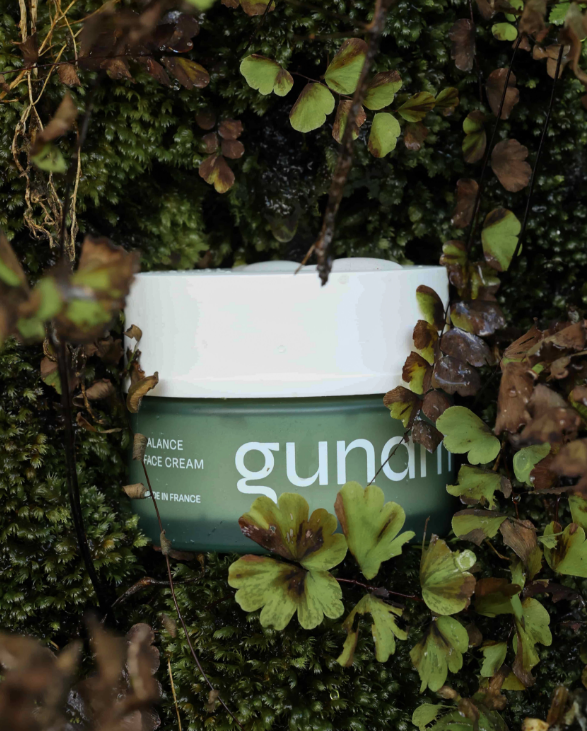
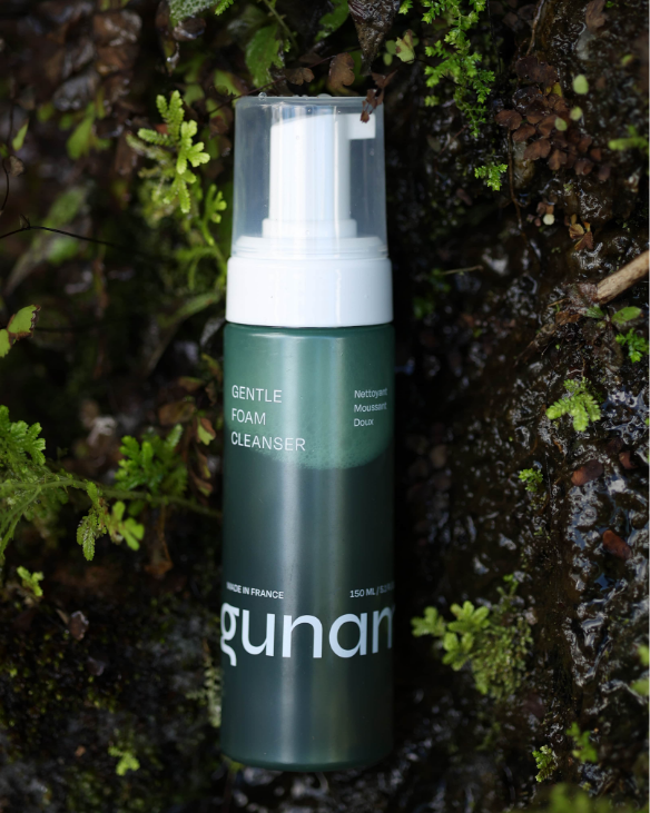
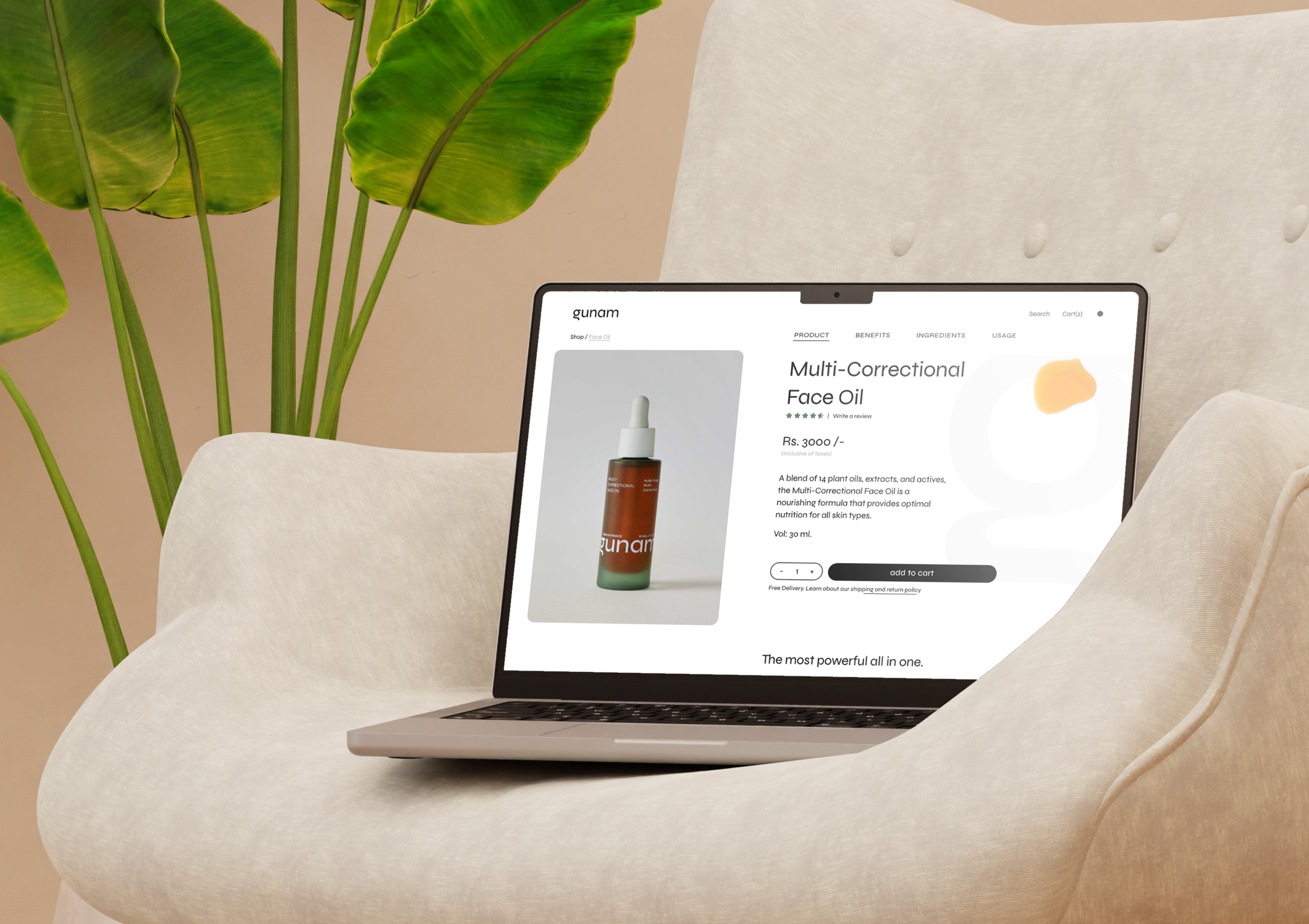
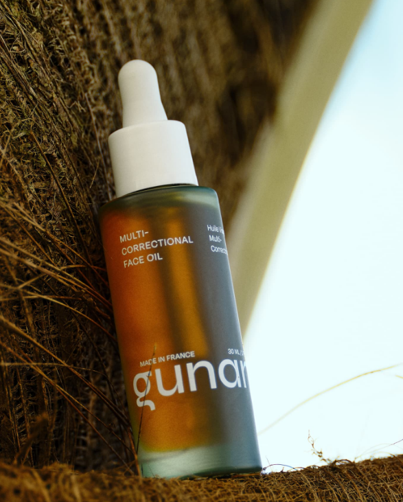
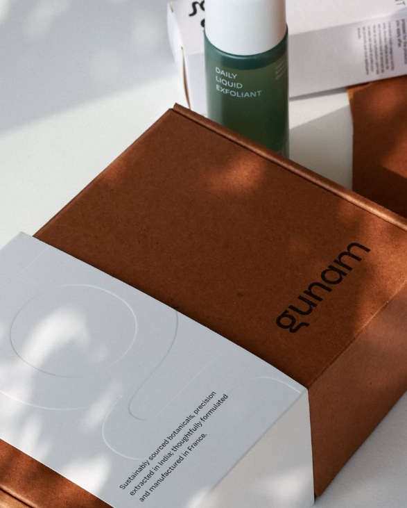
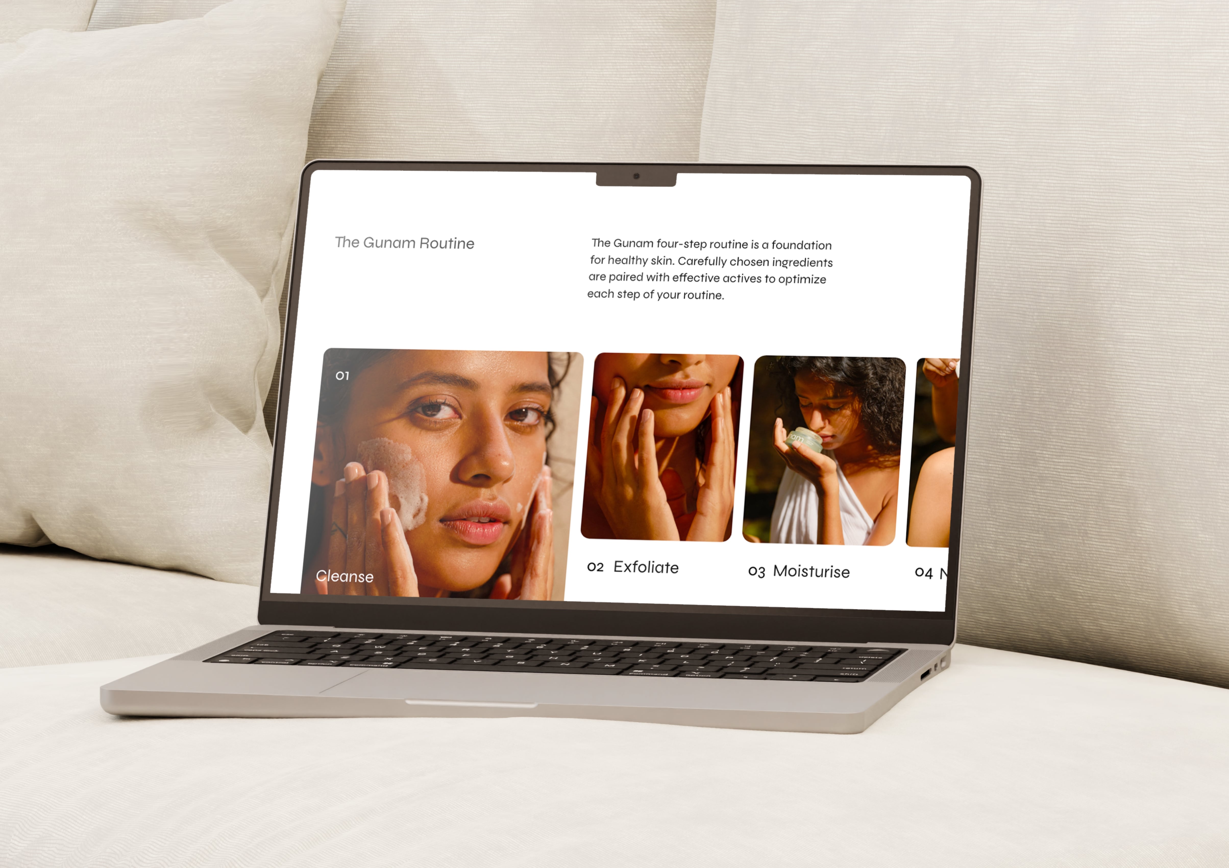
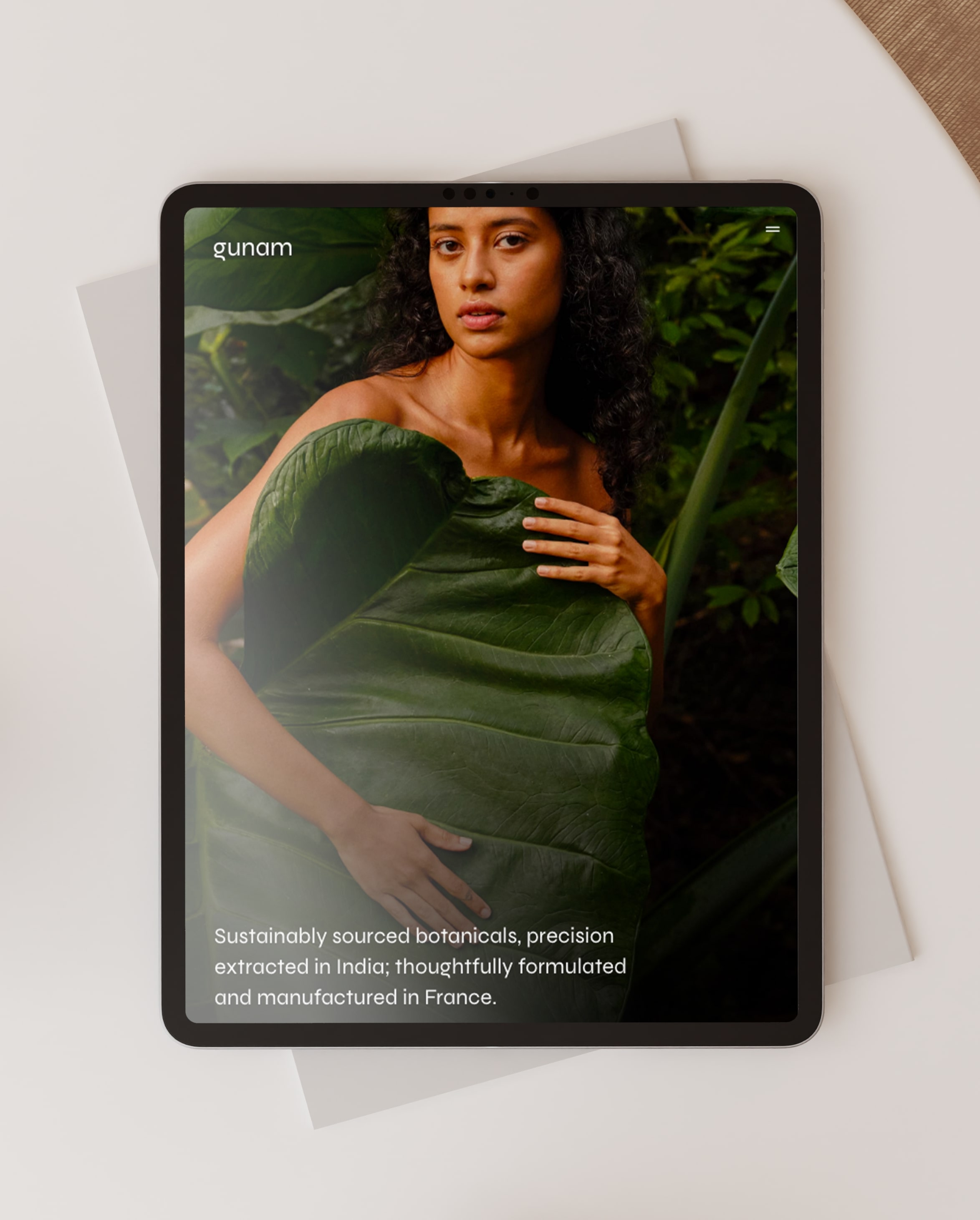
The green is to showcase Kerala’s lushness. The models used in the campaigns had a refreshing earthiness that represents the philosophy of the brand - That nature is beautiful in its whole, without needing to be overly processed. The white and black was to show its no-nonsense laboratory methods but the paper had an uncoated tactile texture with an off white non clinical tone. The website has a soft-spoken honest and sophisticated tone with zero pretence or fluff.
As a small design studio we have the luxury of choosing our clients – and we only work with people and products that are trying to do something authentic and make a difference. I can see earnestly that the product is developed at gunam are the best I have used from India. The ingredients of these being not just the botanicals but also the passion honesty ethics technology and science.


Next Project