
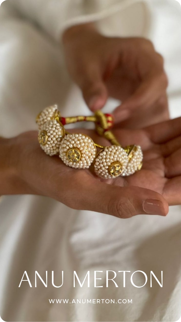
Anu Merton
The Visual identity System created for Anu Merton supports the personality of the
label as it exists today. These elements do not fight, overpower or contrast what has
already been built up - the imagery and products. Rather it tries to organize the
elements to lend a sense of grammar.
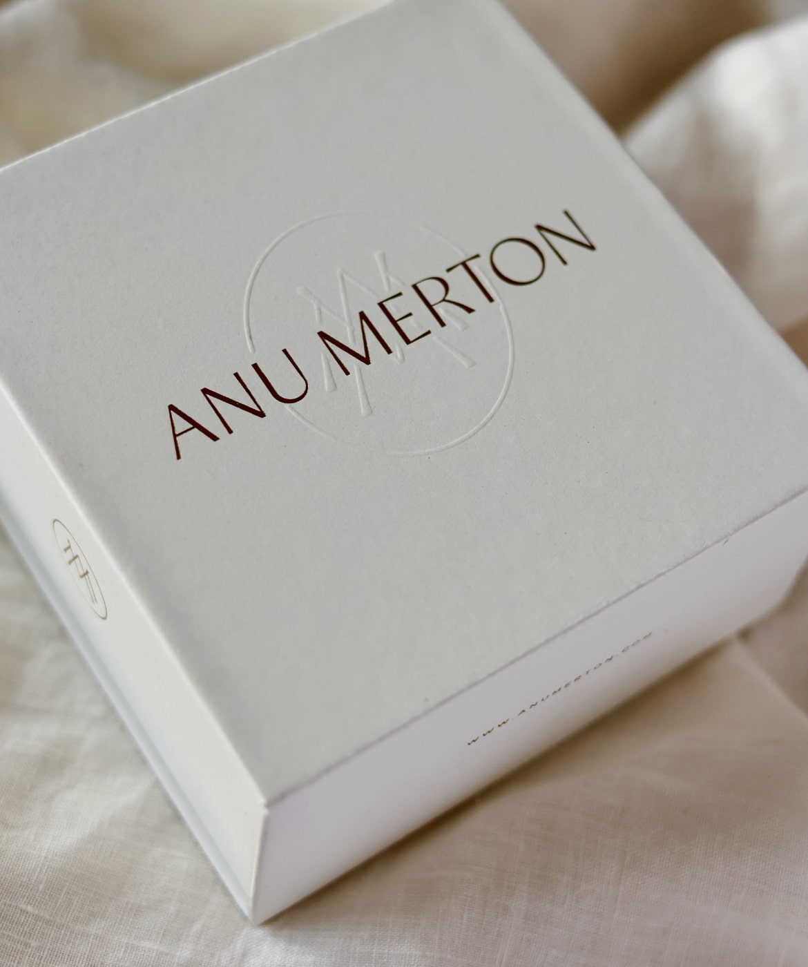
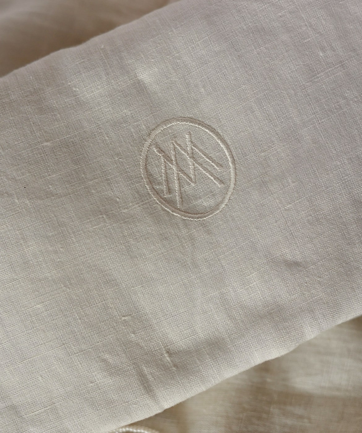
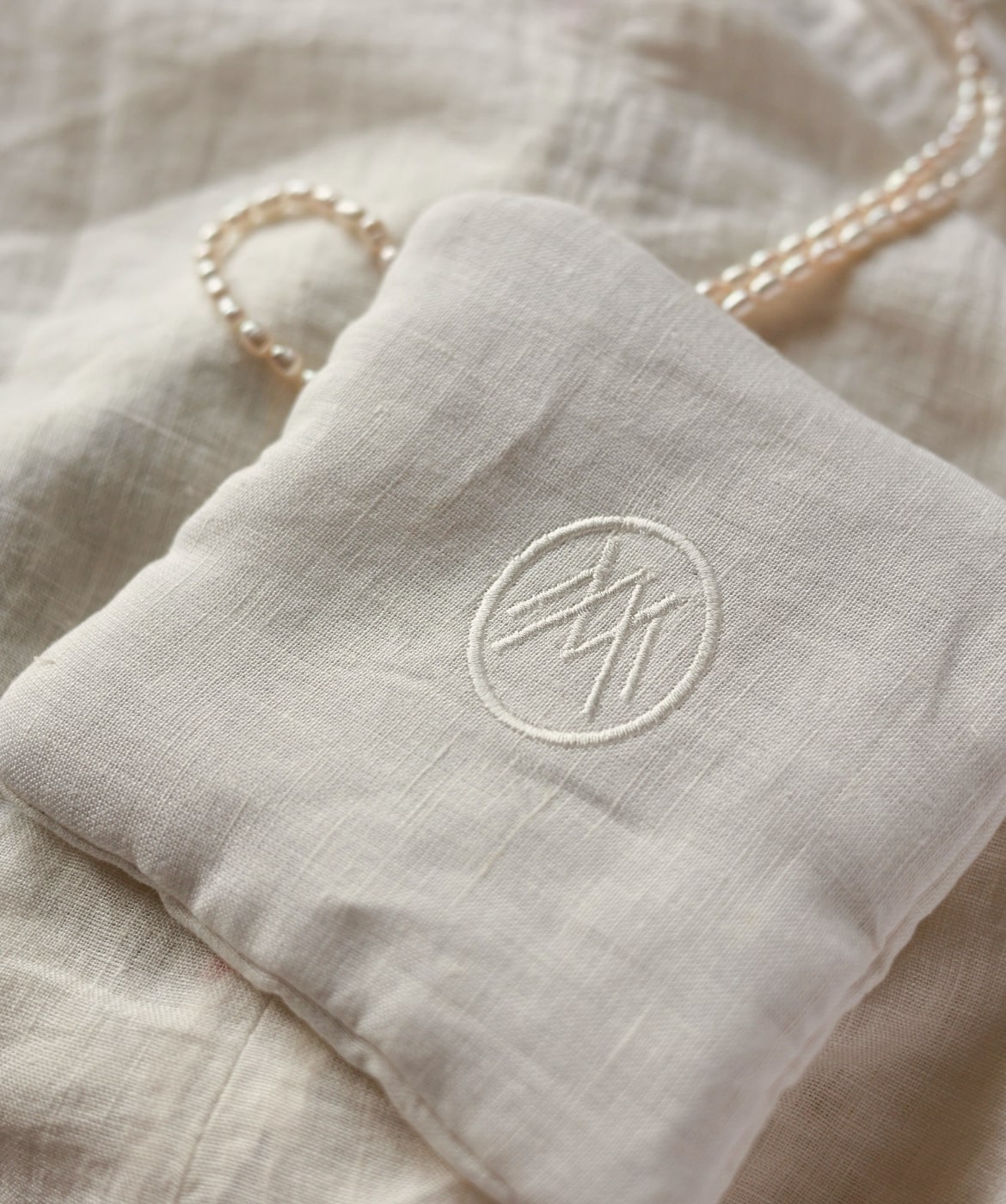
The elements are subtle, with the use of symmetry, soft colors, and delicate thin lines.
While there is a nostalgic feeling intentionally created with the AM monogram, we
ensured a certain modernity with the use of sans serif fonts.
There is an intentional absence of cliches such as floral motifs and paisleys to depict
Indian-ness. The Indian-ness is already apparent in the context - the product, the
setting, the styling.
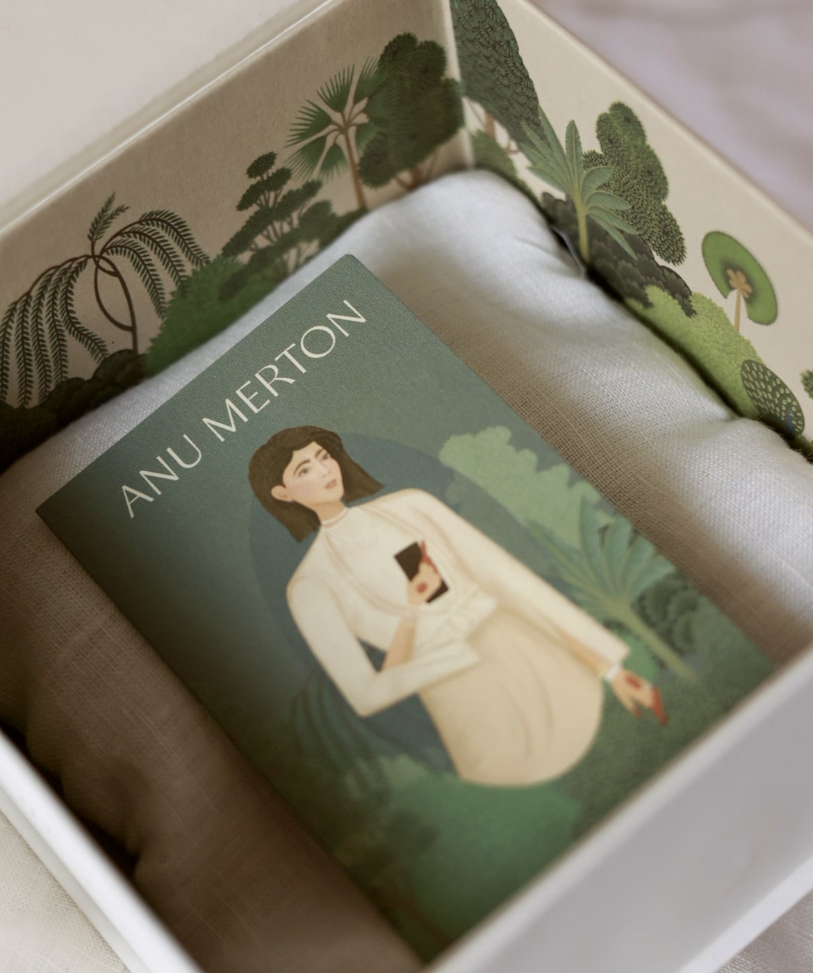
In addition to this, we used artistic elements in historically Indian styles. For example -
Anu’s original portrait was created for the website - in the style of Sheikh Mohammad
Karraya. He was an 18th-century artist who trained in the Patna style. This was done to
show her connection to Bihar. We used Rajasthani miniature painting elements on the
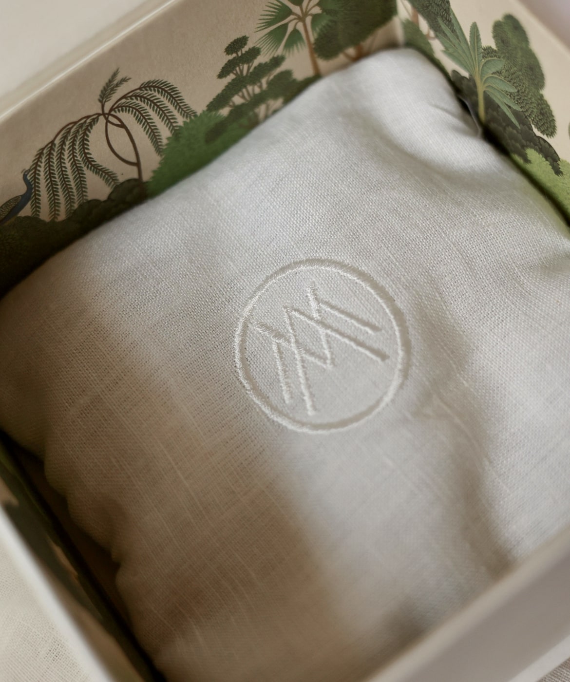
inside of packs to show the jewelry’s provenance - Jaipur.
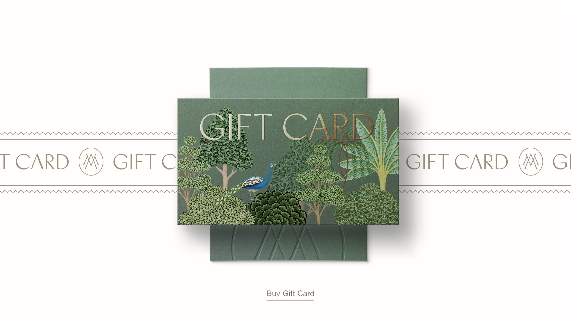
There is a quiet luxury in the use of indulgent layers of textures and materials in the
packaging. Rich papers, fabrics, embroidery, and tactile effects such as blind
embossing.
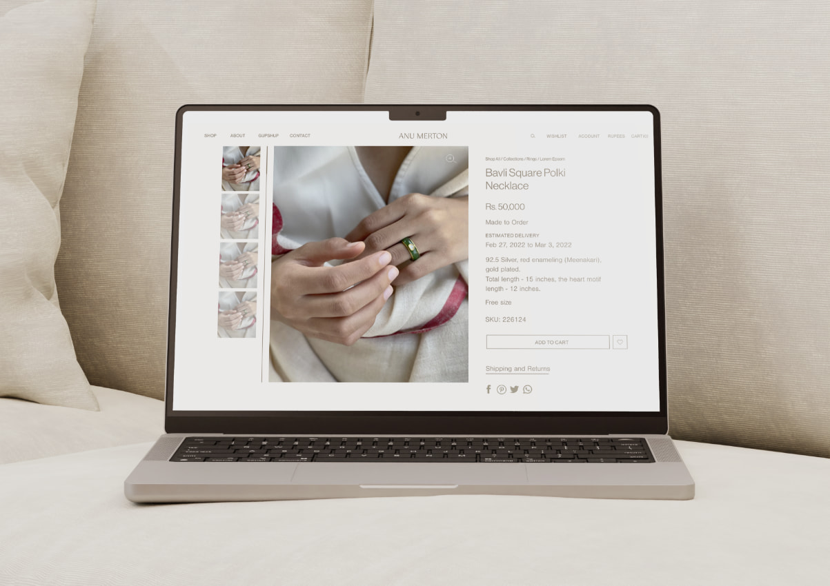
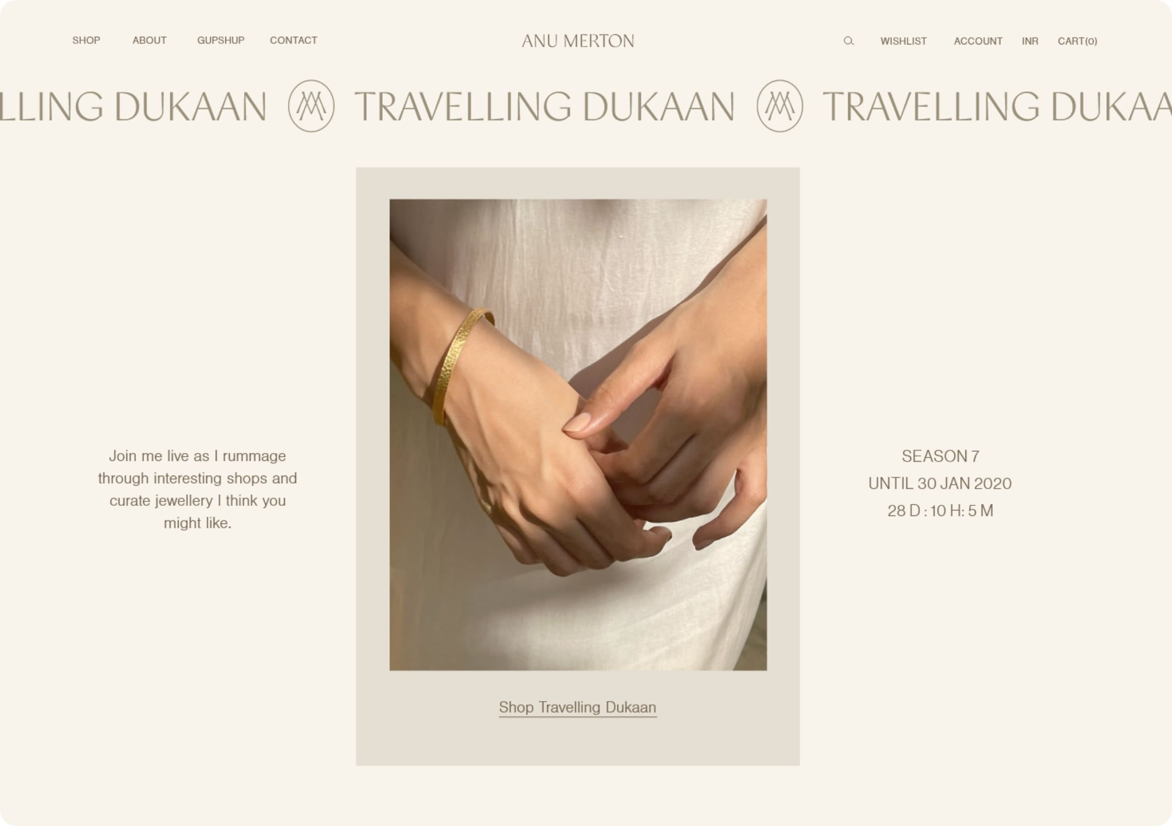
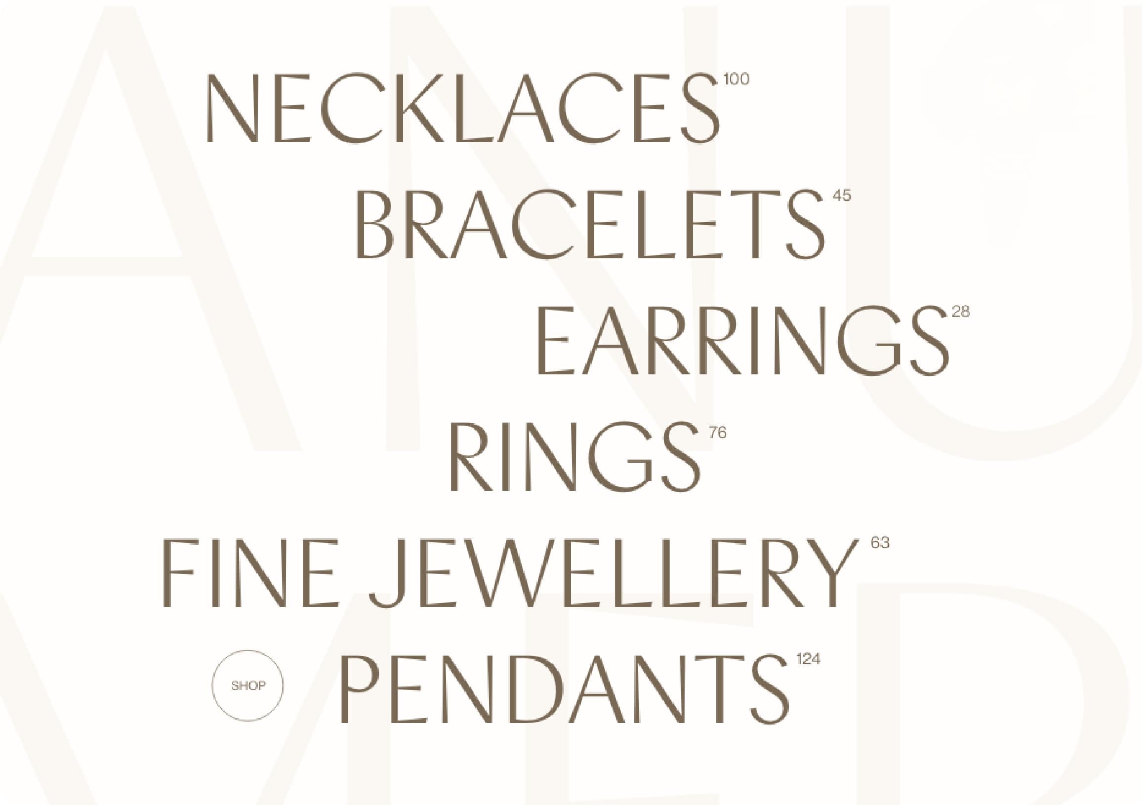
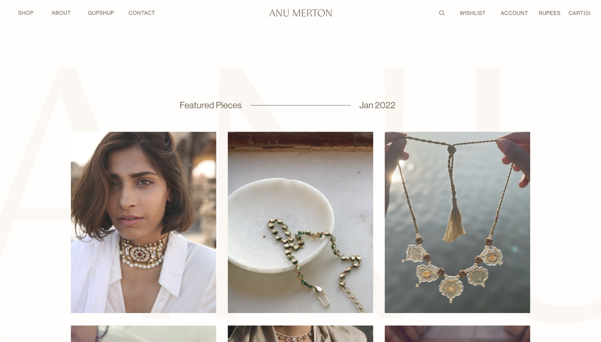
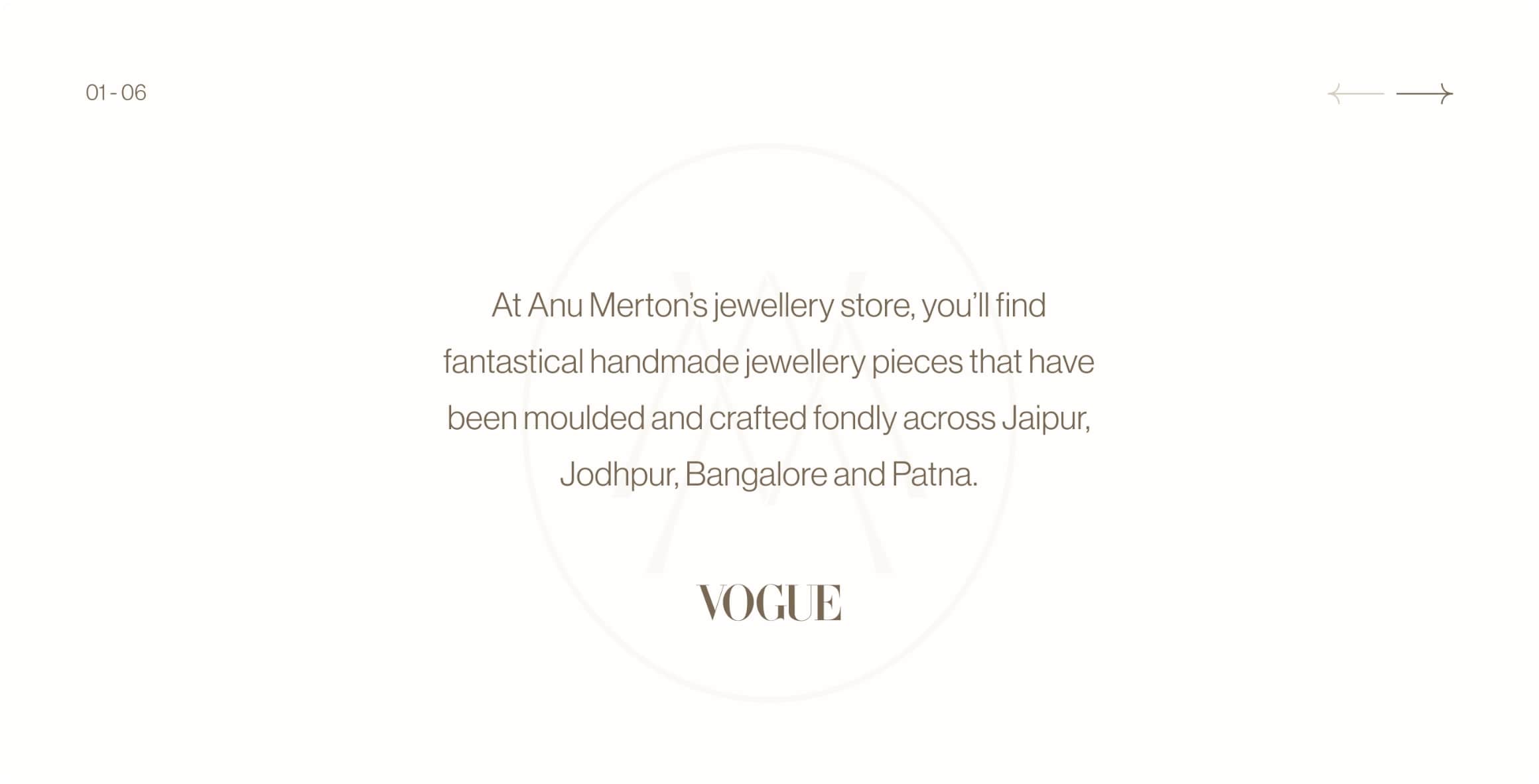
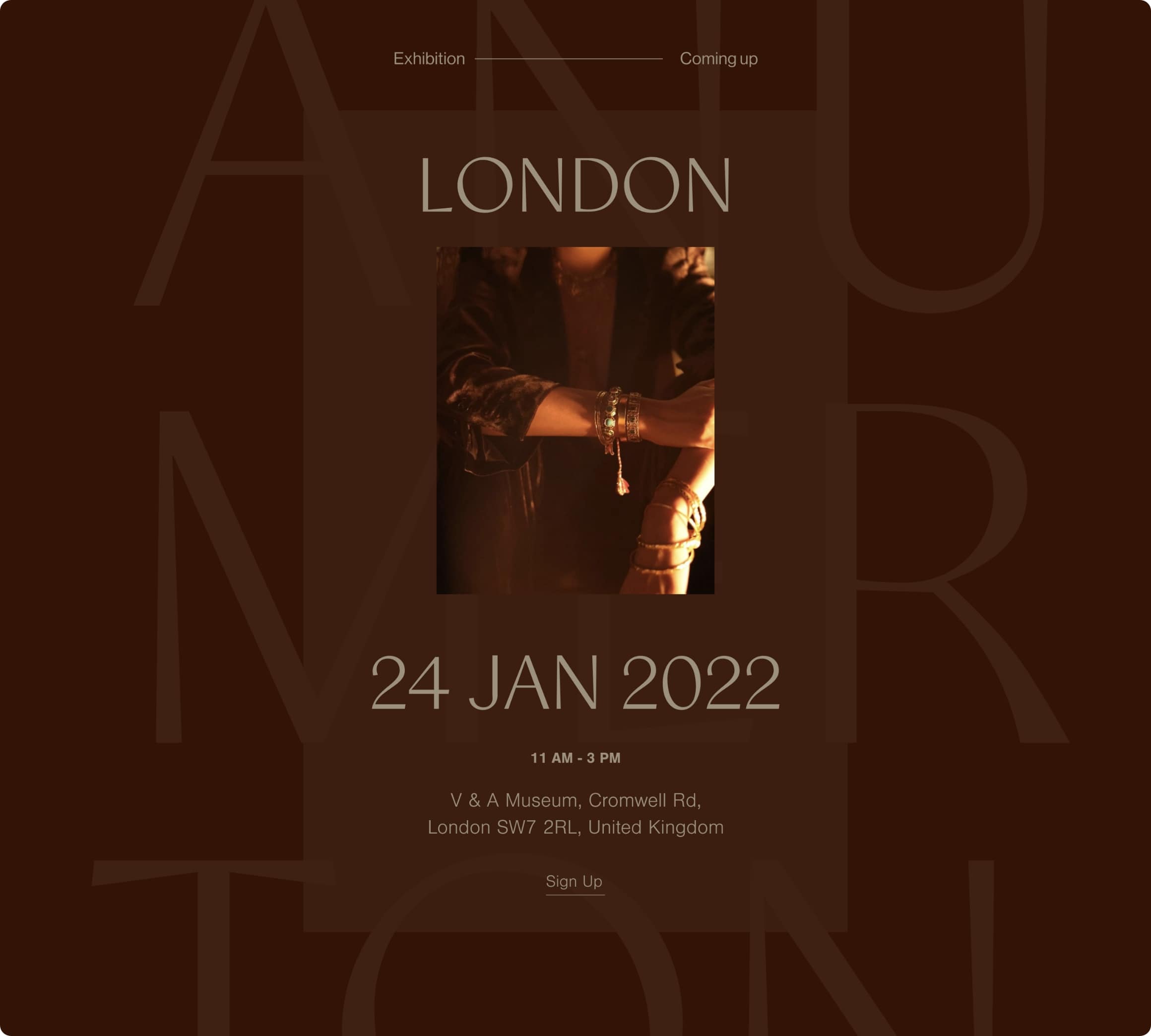
The website has been created in a modular way, without losing the elegant appeal of
the brand, while being functional and solving the design problems that we were
approached to solve.
Looking to the future, we hope these elements will serve as the building tools to see
this brand scale while continuing to express itself with its inherent sophistication and
integrity.

Next Project
