Tarun Tahiliani
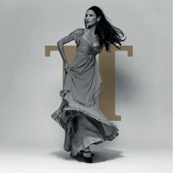
It was a revelation to work with the artistic genius Tarun Tahiliani to develop a new
identity for his iconic fashion house. It involved understanding his ethos, his aesthetic,
his persona, his rootedness, and his vision for the brand.
Developed over the course of 1 year, this project involved spending time with Tarun
and his team at the palatial fortress-like studio in Gurgaon, watching them create new
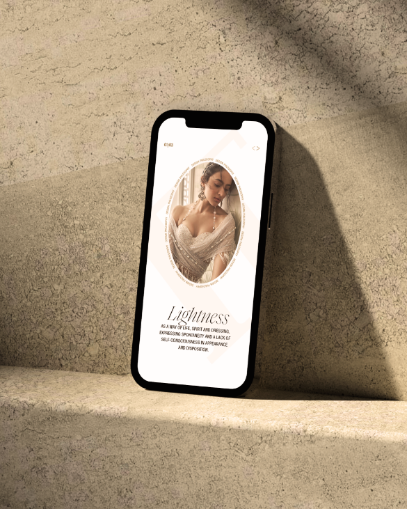
collections, photograph them, and filtering all that information to understand the few
common elements that transcend across – layering, lightness, the color of Indian soil
(mitti), and monochromaticism.
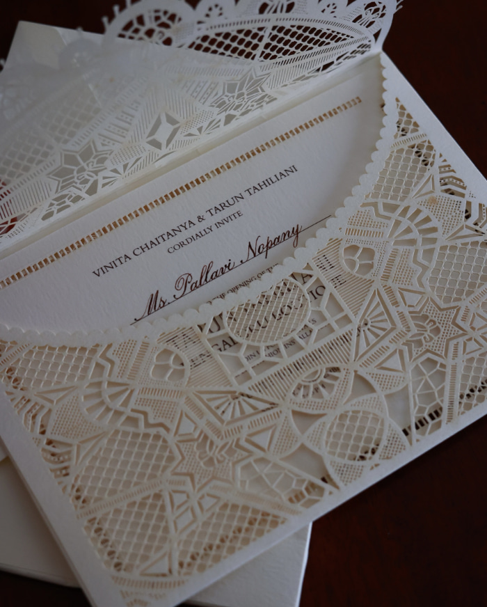
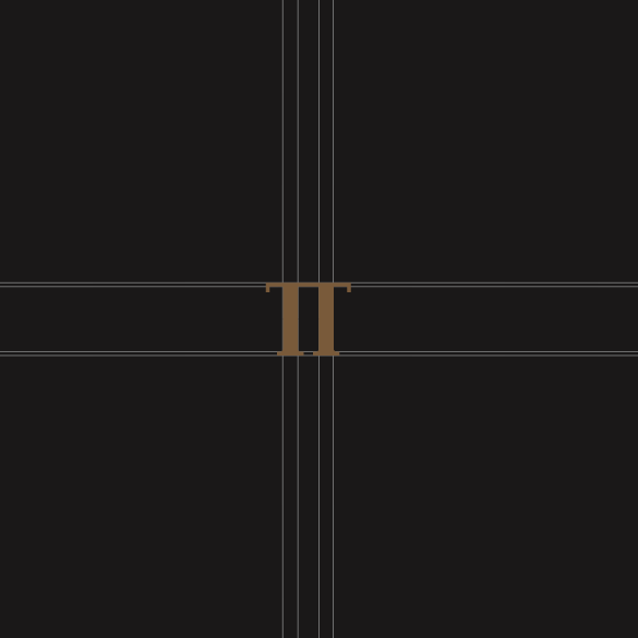
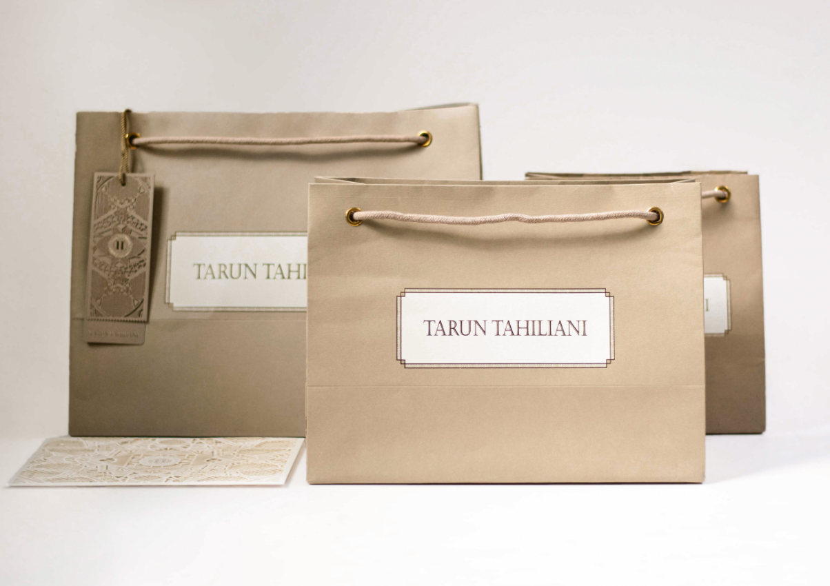
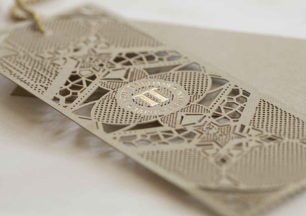
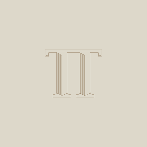
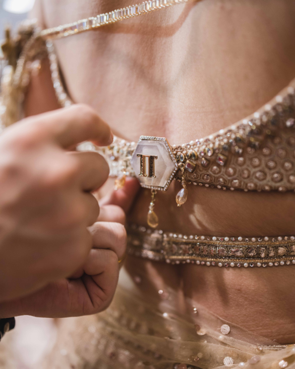
The symbol that was developed is both a pi and a double T. For Tarun, the pi has the
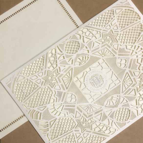
connotation of infinity, and everything comes complete circle. The packaging
developed all had elements of the proprietary TT jaal, taken from Mughal architecture,
an irreplaceable element in the identity of the firm.
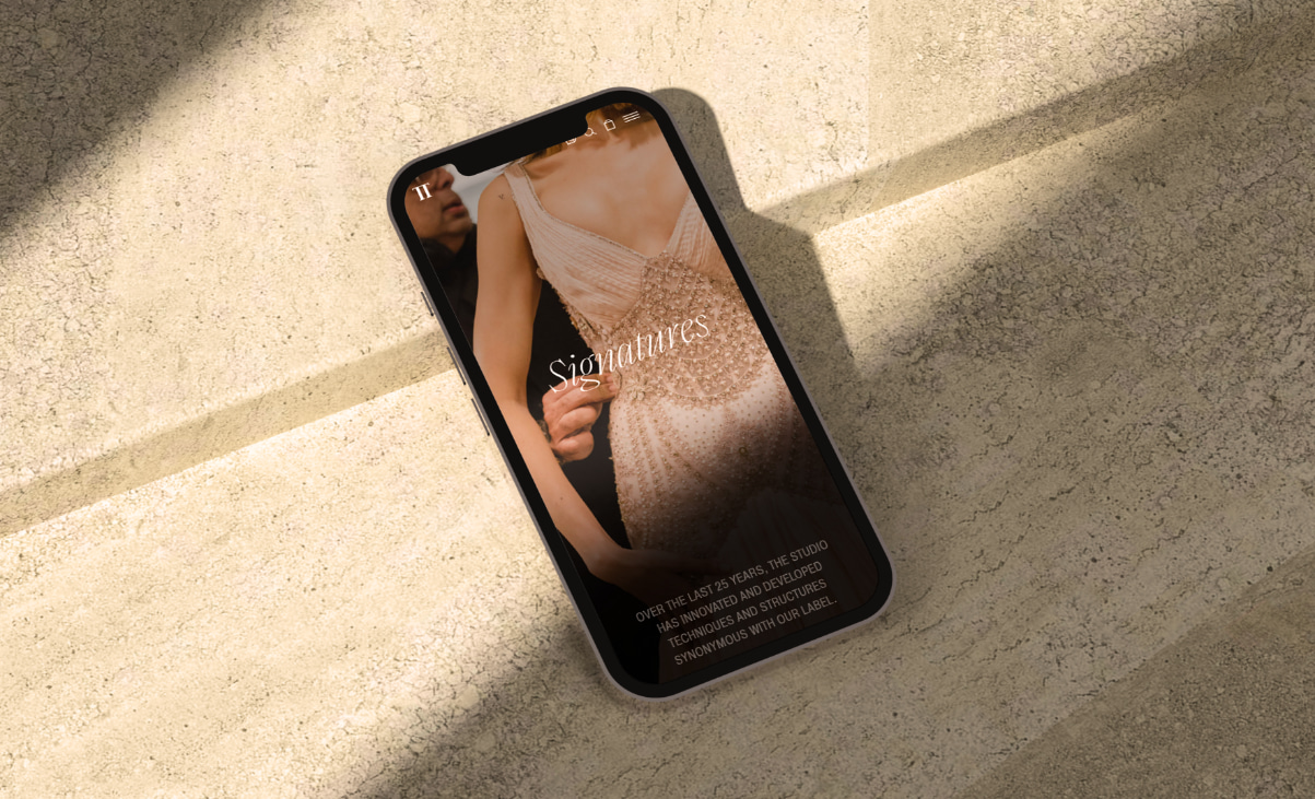
The styling of the symbol had to be simple, geometric, a cross between serif and sans
serif, and voluminous enough that it could be fabricated out of various materials in
smaller sizes to be incorporated into shoes, bags, zips, and packaging.
Next Project